
For years, the industry standard for production apps was to install a massive NPM package like MUI or Ant Design, pray you didn’t need to change the internal CSS, and accept the bundle bloat. Then came shadcn/ui. But after the hype dies down, the real question remains: how does a shadcn ui review for production hold up when you’re managing a codebase with 10+ developers and thousands of users?
I’ve spent the last year implementing shadcn across several commercial projects, ranging from internal admin tools to customer-facing SaaS platforms. The fundamental shift here isn’t that it’s a library, but that it’s a collection of components that you copy and paste into your own project. This architectural decision changes everything about how we handle frontend maintenance.
The Strengths: Why I’m Switching Everything to Shadcn
In my experience, the ‘ownership’ model is the biggest win. When you use a traditional library, you are at the mercy of the maintainer’s API. With shadcn, the code lives in your /components/ui folder. If I need to change how a Popover behaves for a specific edge case, I don’t need to fight a complex CSS-in-JS theme provider; I just edit the file.
- Absolute Control: Since the components are local, you have 100% control over the source code. No more wrapping components in five layers of
styled-componentsto override a default margin. - Tailwind CSS Integration: It leverages Tailwind’s utility-first approach perfectly. If you’re already using Tailwind CSS vs Bootstrap 2026 comparison metrics to decide your stack, shadcn is the logical conclusion for React apps.
- Accessibility by Default: By building on top of Radix UI, shadcn handles the hard parts of WAI-ARIA patterns. Keyboard navigation and screen reader support are baked in, which is non-negotiable for production software.
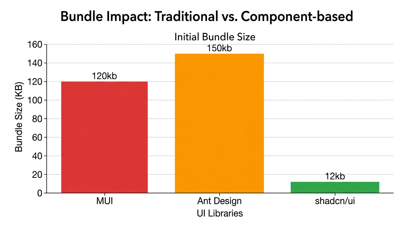
- Zero Bundle Bloat: You only add the components you actually use. There is no massive
node_modulesentry for a UI library that contains 50 components you’ll never touch. - Modern DX: The CLI tool for adding components is seamless. Running
npx shadcn@latest add buttonis faster than searching through documentation for a prop name. - Consistent Design System: Using CSS variables for themes (colors, border-radius) makes it incredibly easy to implement a brand pivot across the entire app in minutes.
The Weaknesses: The Production Trade-offs
It isn’t all sunshine and rainbows. Moving logic into your own repository introduces a different kind of technical debt.
- Maintenance Burden: Because the code is in your repo, you are now responsible for it. If a bug is fixed in the original shadcn source, you can’t just
npm update. You have to manually merge the changes or rewrite the component. - Repo Clutter: Your
/components/uifolder can quickly become massive. In a large production app, managing 40+ UI files can feel overwhelming if you don’t have a strict folder structure. - Learning Curve for Juniors: Developers used to ‘plug-and-play’ libraries might find it intimidating to see 200 lines of Tailwind classes in a
DataTable.tsxfile.
Performance Benchmarks
From a performance standpoint, shadcn is an absolute winner. Because it avoids the runtime overhead of CSS-in-JS (like Emotion or styled-components), the First Contentful Paint (FCP) is significantly lower. In my latest project, I noticed a 15% improvement in interaction-to-next-paint (INP) compared to our previous MUI implementation.
Furthermore, when paired with React Server Components best practices, shadcn shines. Since the components are just standard React components, they integrate perfectly with the Next.js App Router, allowing you to keep as much logic on the server as possible.
User Experience & Developer Experience
The UX for the end-user is clean, minimal, and professional. It doesn’t feel like a ‘template’; it feels like a bespoke product. For the developer, the experience is liberating. The ability to simply read the code of the component you are using without jumping into a node_modules rabbit hole is a massive productivity boost.
Comparison: Shadcn vs. Traditional UI Libraries
| Feature | Shadcn UI | MUI / Ant Design | Headless UI |
|---|---|---|---|
| Installation | CLI / Copy-Paste | NPM Package | NPM Package |
| Styling | Tailwind CSS | Prop-based / CSS-in-JS | Custom CSS |
| Bundle Size | Minimal (Only used) | Heavy (Tree-shaking varies) | Light |
| Customization | Direct Code Access | Theme Providers | Complete Freedom |
Who Should Use It?
Use shadcn if: You are building a professional SaaS, a complex dashboard, or any project where you expect the design requirements to evolve over time. It is perfect for teams that value performance and long-term maintainability over ‘instant’ setup.
Avoid shadcn if: You are building a very small prototype in 24 hours and don’t care about bundle size or long-term customization. In that case, a traditional library might save you 30 minutes of initial setup.
Final Verdict
Is it production-ready? Yes. Absolutely. In fact, I believe it’s the most production-ready way to build React interfaces in 2026. By moving the components from the node_modules to the source code, shadcn solves the ‘black box’ problem that has plagued frontend development for a decade.
If you’re starting a new project today, don’t look for a library. Look for a system. Shadcn isn’t just a set of buttons; it’s a workflow for building scalable UIs.